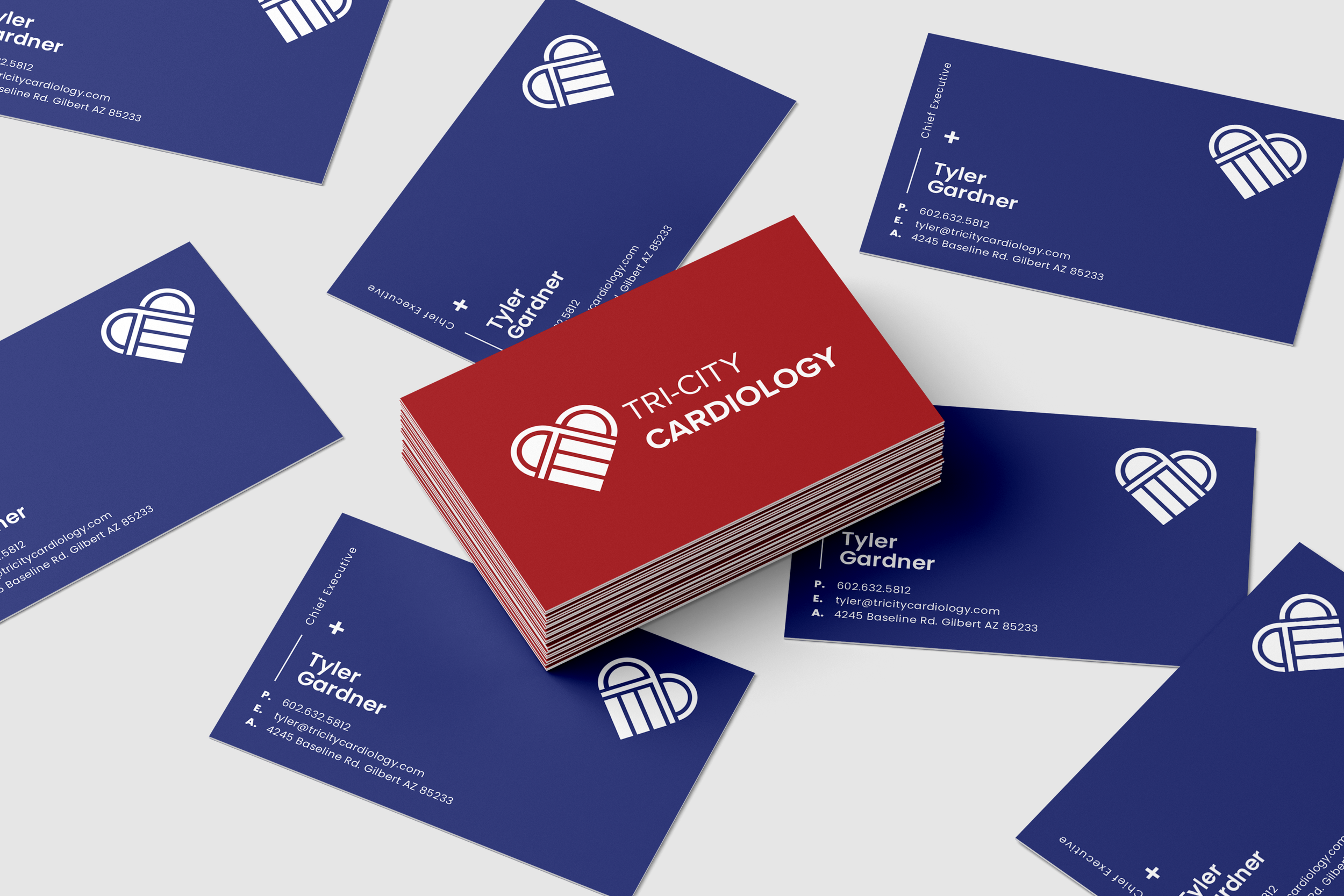

Tri-City Cardiology
LOGO DESIGN
KEYWORDS:
Professional, Modern, Caring, Clean
About the Client:
With over 40 years of experience in heart and vascular care, Tri-City Cardiology is Phoenix's premier cardiology practice, where patient satisfaction and care are the top priority.
The Design Process:
Redesigning the logo for Tri-City Cardiology was a rewarding challenge that involved striking a balance between modern aesthetics and the established credibility of the original design.
My approach began with a thorough review of the existing logo to understand its core elements and significance. I then focused on simplifying and streamlining these components to create a more contemporary, clean look while preserving the essence of the brand. By incorporating sleek lines and a refreshed color scheme, I aimed to enhance the logo’s visual appeal and readability, all while ensuring it continued to convey the professionalism and trustworthiness that Tri-City Cardiology is known for.